
As a dashboard tool that can be used for free, Data Studio has become very popular. I have had many opportunities to use Data Studio in both my personal and company work.
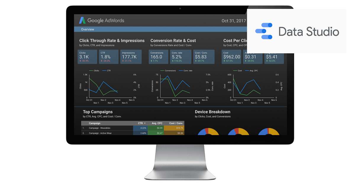
However, compared to the commercial BI tool “Tableau”, there are restrictions on what you can do, and it is somewhat difficult to use. However, Data Studio has a mechanism called “Community Connector” and “Community Visualization” to remove that limitation. This time, I would like to introduce “Community Visualization” among these two mechanisms.
The world of Data Studio expanded by developers around the world
Data Studio provides a mechanism that allows general developers to customize the standard data connectors and BI components. Data Studio is a relatively latecomer among BI tools, and the general view is that its standard features are inferior to commercial BI tools. However, with the introduction of a mechanism that allows general developers to customize, many developers will start working on connector and component development, and the distance from commercial BI tools will shrink. It is considered.
community connector
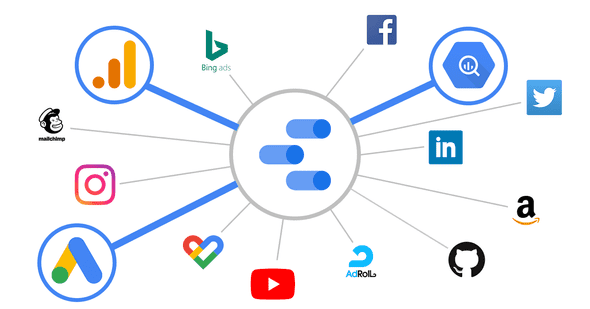
A data connector is a type of data source that can be selected in Data Studio. There are 18 standard data connectors such as “Google Analytics”, “Google Ads”, “BigQuery”, “Spreadsheet”, and “MySQL”. These 18 connectors are called “Google Connectors” and are standard connectors developed by Google.
Separately, there are other types of connectors called “partner connectors” and “open source connectors”, collectively referred to as “community connectors”. Both are data connectors developed by third-party developers, and “open source connectors” seem to have higher requirements and thresholds. Among these “partner connectors” there are not only free ones, but also paid ones. However, it is a useful mechanism that allows you to connect many platforms that Google itself cannot manage, such as “Facebook Ads”, “Adobe Analytics”, and “Amazon Ads”, to Data Studio.
As of January 23, 2019, 122 “partner connectors” are available and 11 “open source connectors” are available. In addition, as the name suggests, the “open source connector” has the program code of the data connector developed on Github. , it is also possible to give back to the Data Studio community.
In addition, “Community Connector” can be used not only in a method that is open to the public for use, but also in a closed environment such as only oneself or within one’s own company without disclosing it to the general public. It is
Please note that community connector development is done in G Script (formerly Google Apps Script), and community connector development itself is not very difficult for those who are familiar with JavaScript.
community visualization
Data Studio’s standard visualization method depends on the classification method, but it cannot be said that it is rich. Tableau, a commercial BI tool, allows for a variety of visualizations such as box plots, tree maps, and histograms, but Data Studio does not provide such visualizations as standard.
However, Data Studio provides a mechanism for general developers to develop this visualization method as well. We call this mechanism “community visualization”. Compared to Community Connectors, Community Visualizations are slower to emerge and more complex to implement, so there aren’t many publicly available types. There are now probably six visualizations available to the public, found on the developer help page, Data Studio Community Visualizations . For example, “Sankey diagram” is a visualization method that can visualize transitions, but it could not be handled with standard data studio visualization. Such visualization can be solved by using community visualization.
As of January 23, 2019, I could only find the 6 types of “Community Connectors” listed in the link above.
In addition, as with community connectors, community visualizations are not only open to the public for use by self-developed products, but are also used in a closed environment, such as only for themselves or within their own company, without being open to the public. It is also possible to
The community visualization is developed using JavaScript. Also, for drawing graphs, I think that there are many cases where you develop using the d3 library or Google Chart API instead of implementing it from scratch yourself, so knowledge of that is required, and community connectors The current situation is more difficult.
Community visualization developed this time
overview
This time, it was the first community visualization development, so I developed something very simple. What we developed is a community visualization that has the function of “drawing a question mark and displaying a supplemental explanation with a tooltip when you mouse over it”, as shown in the capture above.
Most common community visualizations involve connecting to data sources and visualizing the data they contain. However, this time, it is the first development, and the purpose is to know the difficulty of development and the general flow, so I made it a simple component like this.
Although it is a simple component, as the number of elements in the Data Studio dashboard increases, you may want to write an explanation in the dashboard. In such a case, if there is space to place a text box, it is good to use a text box, but often there is not such space left. The component we developed this time will be able to draw a message in the form of a tooltip as long as there is enough space to place one icon in such a case, so I think it is simple and highly usable. .
How to Use
The source code of the community visualization developed this time is on Github, and the usage method is also described in Github’s README.md, so please check it from the link below.
General users can also use it by operating in the same flow. However, whereas the original community visualization is a mechanism for displaying data using a data source, this component uses a slightly different usage from its original purpose, Please keep in mind that meaningless operations have occurred along the way (it would be nice if it could be avoided with an option during development, but at present I did not know how to avoid it).
Other possible community visualization examples
The visualization developed this time is very simple, but there are other visualization examples that cannot be implemented with the standard data studio visualization, but are likely to be in high demand by marketers.
Advertising copy report
I think that some people who create ad operation reports create reports for each ad text. For this type of ad copy report, it is easier for the viewer to understand if the columns of the report are displayed in a format that follows the actual display layout of the ad copy. However, when you actually try to do it, the man-hours to create the report increase, and it is not straightforward.
Actually, for images, it is possible to embed an image in a cell by putting the image URL in the dimension and changing the dimension setting, but it is currently not possible for the ad text. Therefore, by using Community Visualization and customizing it, it seems possible to easily create an effective ad copy report.
word cloud
I think there are many cases where keyword performance is quantified in tabular format and used as a report. However, it is very difficult to decipher anything from a large number of numerical values like a keyword report. In such a case, if you display keywords in the form of a “word cloud” in which the number of impressions (or some index) is replaced by the font size, you may find an important hint.
Furthermore, if it is possible to calculate the distance between keywords using natural language processing, etc., and display keywords that are close together, it may lead to new discoveries.
radar chart
If you are creating a comparative report with other companies, I think it would be good to use a visualization like a radar chart as a summary report. Currently, if you try to use a radar chart as a report, the standard data studio cannot handle it, and Excel will come into play. Actually, even Tableau, a commercial BI tool, does not have a radar chart as a standard component yet.
summary
This time, I developed a very simple community visualization. Through this development, I was able to understand the development flow and mechanism of community visualization. If more developers start developing community visualizations, like community connectors, it feels like the landscape of BI tool vendors is about to change dramatically.