
“I want to trim the image to a square with
CSS” “How can I trim the image with CSS?”
Some of you may have questions like the above.
Wouldn’t it be nice to be able to crop images with CSS without using editing tools?
In this WEBCAMP MEDIA, I will explain how to crop an image using CSS properties.
- How to trim with object-fit
- How to change the position of the cropped image
- How to crop an image to a circle
- How to trim with overflow and position
- If trimming doesn’t work
I will explain the above items.
By reading this article, you will understand how to crop an image using CSS properties, so be sure to check it out!

Table of contents
- How to crop an image with CSS object-fit
- How to use object-fit
- How to change the trimming position with CSS object-position
- Using object-position
- Make image cropping circular with border-radius in CSS
- How to make it circular with border-radius
- How to crop an image with CSS overflow and position
- What to do when you can’t crop an image with CSS
- summary
How to crop an image with CSS object-fit
object-fit is a CSS property that allows you to change the shape of the image to fit the specified width and height.
The values that can be specified for object-fit are as follows.
- fill: Initial value for object-fit. Since the image is expanded according to the specified width and height, the aspect ratio may be lost.
- contain: Expand the image while maintaining the aspect ratio.
- cover: Expands the image to the specified height and width while maintaining the aspect ratio. Protruding portions due to proportion problems are trimmed.
- none: State that the image size does not change.
- scale-down: If either the specified height or width is larger than the image, it will be “contain”, and if it is smaller, it will be “none”.
When cropping the image, use the cover value above.
How to use object-fit
By using “object-fit:cover;” and width and height properties, you can crop the image to the desired size.
Let’s actually trim the image using the sample code.
HTML
<!DOCTYPE html>
<html lang="ja">
  <head>
    <meta charset="utf-8">
    <meta name="viewport" content="width=device-width, initial-scale=1, minimum-scale=1">
    <link rel="stylesheet" href="./css/test.css">
    <title>タイトル</title>
  </head>
<body>
  <div class="flex">
    <div class="cover1">
      <img src="pic/test.png">
    </div>
    <div class="cover2">
      <img src="pic/test.png">
    </div>
    <div class="cover3">
      <img src="pic/test.png">
    </div>
  </div>
</body>
</html>
CSS
.flex{
  display: flex;
  justify-content: space-around;
}
.cover1 img{
  width: 250px;
  height: 250px;
}
.cover2 img{
  width: 100px;
  height: 250px;
}
.cover3 img{
  width:250px;
  height: 80px;
}
img{
  object-fit: cover;
}
Execution result
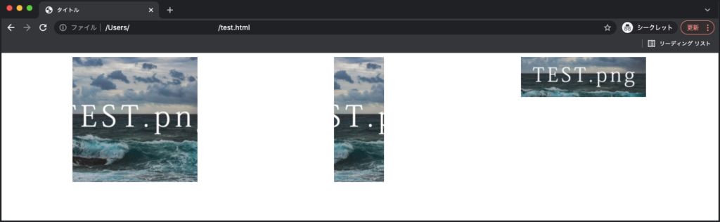
By changing the width and height values along with “object-fit:cover;” as above, you can trim the image in various shapes with the center of the image as the fulcrum.
How to change the trimming position with CSS object-position
Trimming using “object-fit: cover;” cannot be trimmed around the top, bottom, left, and right because the center of the image is the fulcrum.
Use object-position when you want to specify where to crop.
object-position can determine the location of content such as images and videos.
- Specify image size with width and height
- Change image position with object-position
- Trim the protruding part with “object-fit: cover;”
By using the three CSS properties above, you can change the trimming position.
Using object-position
The usage of object-position is as follows.
Enter a value that specifies the horizontal position of the image in the first value, and a value that specifies the vertical position in the second value.
By default, 50% is specified for the top, bottom, left, and right, so the center of the image is the fulcrum for trimming.
You can also enter “top, right, bottom, left” values and numbers to determine the starting point to move the image.
I will explain how to use it with sample code.
HTML
<!DOCTYPE html>
<html lang="ja">
  <head>
    <meta charset="utf-8">
    <meta name="viewport" content="width=device-width, initial-scale=1, minimum-scale=1">
    <link rel="stylesheet" href="./css/test.css">
    <title>タイトル</title>
  </head>
<body>
  <div class="flex">
    <div class="cover1">
      <img src="pic/test.png">
    </div>
    <div class="cover2">
      <img src="pic/test.png">
    </div>
    <div class="cover3">
      <img src="pic/test.png">
    </div>
  </div>
</body>
</html>
CSS
.flex{
display: flex;
justify-content: space-around;
}
img{
width: 250px;
height: 250px;
object-fit: cover;
}
.cover1 img{
object-position: right 100px bottom 30px;
}
.cover2 img{
object-position: 150%;
}
.cover3 img{
object-position: top 35px left 100px;
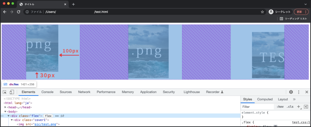
}For the first image, specify a value of right to move the image 100px left from the right side, and specify a value of bottom to move the image up 30px from the bottom.
In the second image, the center default is 50%, so it is shifted to the right by the width of the image (100%). This method is perfect if you want to crop the left half of the image.
The third image moves the image 35px down from the top of the image and 100px from the left to the right.
Execution result
Make image cropping circular with border-radius in CSS
border-radius is a CSS property that allows you to add rounded corners to an element .
By using “object-fit:cover;” and border-radius together, you can create a circular shape without losing the aspect ratio of the image.
The method for specifying border-radius is as follows.
border-radius: 左上の角 右上の角 右下の角 左下の角;
border-radius: 左上と右下の角 右上と左下の角;
border-radius: 全ての角;
Depending on how you specify the value, you can specify only some corners or specify all corners at the same time to add roundness.
The detailed usage of border-radius is explained in detail in the following article.
How to make it circular with border-radius
Using “object-fit: cover;” and border-radius, the sample code explains how to round the corners of the image.
sample code
HTML
<!DOCTYPE html>
<html lang="ja">
  <head>
    <meta charset="utf-8">
    <meta name="viewport" content="width=device-width, initial-scale=1, minimum-scale=1">
    <link rel="stylesheet" href="./css/test.css">
    <title>タイトル</title>
  </head>
<body>
  <div class="flex">
    <div class="cover1">
      <img src="pic/test.png">
    </div>
    <div class="cover2">
      <img src="pic/test.png">
    </div>
    <div class="cover3">
      <img src="pic/test.png">
    </div>
  </div>
</body>
</html>
CSS
.flex{
display: flex;
justify-content: space-around;
}
img{
width: 250px;
height: 250px;
object-fit: cover;
}
.cover1 img{
border-radius: 20px 30px 50% 10%;
}
.cover2 img{
border-radius: 50%;
}
.cover3 img{
border-radius: 20% 40%;
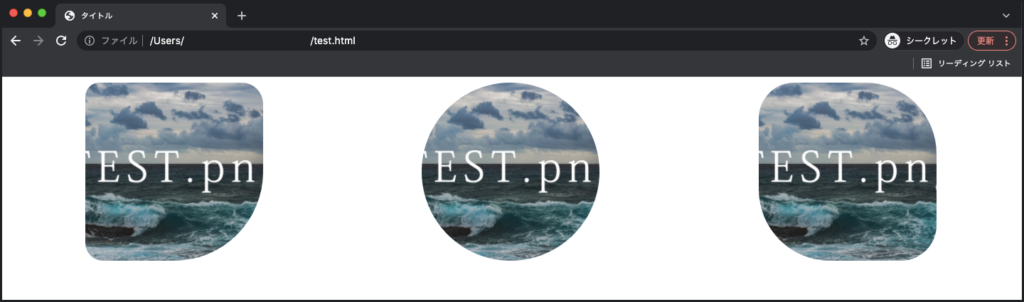
}Add roundness using “number + px or %” as above. In the first image, I added a different radius to each of the 4 corners.
In the second image, a value of 50% is used to crop the image to a nice circular shape.
Execution result
How to crop an image with CSSoverflow and position
overflow allows you to set how overflowing inline elements are handled , and position allows you to specify the position of the inline element .
You can freely trim the image by hiding the image that protrudes from the element with overflow and changing the position of the image with position.
I will explain how to use it with sample code.
HTML
<!DOCTYPE html>
<html lang="ja">
  <head>
    <meta charset="utf-8">
    <meta name="viewport" content="width=device-width, initial-scale=1, minimum-scale=1">
    <link rel="stylesheet" href="./css/test.css">
    <title>タイトル</title>
  </head>
<body>
    <div class="cover">
      <img src="pic/test.png">
    </div>
</body>
</html>
CSS
.cover{
width: 300px;
height: 300px;
position: relative;
overflow: hidden;
margin:0 auto;
}
.cover img{
width: 500px;
position: absolute;
top: 50%;
left: 50%;
transform: translate(-50%,-50%);
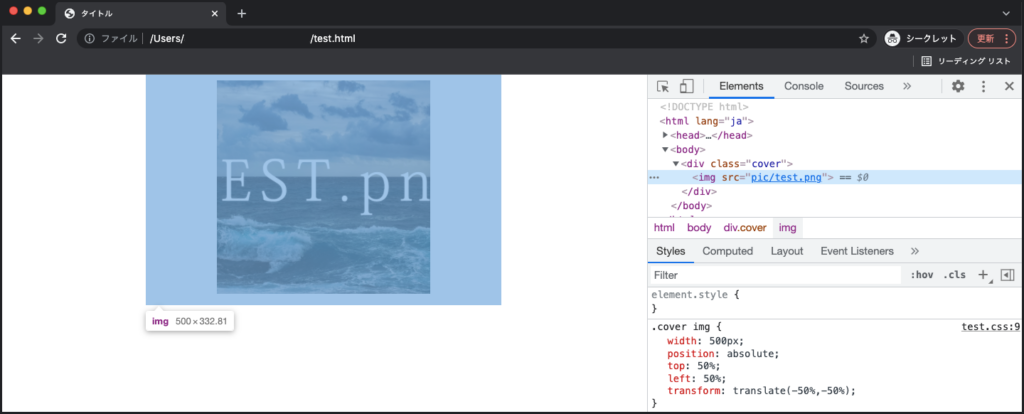
}Create a box of 300px in height and width in the parent element of the image, specify “overflow: hidden;”, and implement processing to trim the elements that protrude from the box. The starting point for moving the image is specified in the box with “position: relative;”.
The image is placed in the center of the parent element by specifying “position: absolute;” in the img tag that displays the image. “width: 500px;” makes the size larger than the parent element, so the protruding part is trimmed.
Also, you can change the trimming range by changing the height and width of the parent element, so it would be a good idea to move it while changing the numbers based on the sample code.
How to use position is explained in detail in the article below, so if you don’t know how to use it, please check it out!
Execution result
What to do when you can’t crop an image with CSS
If trimming the image with CSS does not work, check the following items.
- Is the method for specifying trimming correct?
- Is the width of the image to be cropped smaller than the parent element?
There is a possibility that it is not working well because the method of specifying trimming is wrong.
For example, trimming may not be possible due to mistakes such as specifying object-fit as the parent element of the image, or specifying overflow as the image.
In addition, the mechanism of trimming with CSS is realized by hiding the image that protrudes from the parent element. Let’s also check that if the size of the image fits within the parent element, it cannot be trimmed .
summary
This time, I explained how to crop an image using CSS properties. How was it?
If you want to crop the image from the center, use CSS object-fit, and if you want to move the image position, use object-position together.
You can also trim by specifying overflow as the parent element and position as the image, so please refer to it!